Better than yesterday: Why we refreshed the Paddle brand

It’s been a busy few months at Paddle. We’ve been working hard behind the scenes to take our brand to the next level.
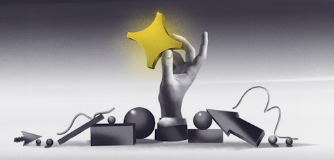
So, as we say bye-bye to blue and hello to yellow, I want to share more with you about our new look and how we used this refresh as a chance to make brand changes that are more than skin deep.
Let’s take a closer look.
Why refresh the Paddle brand?
Changing your branding is a bold move. It takes a huge amount of work from a number of people across the business, it’s a big investment that isn’t without risk. So, why did we do it?
I moved from Events to Brand Manager at Paddle two and a half years ago. Taking the reigns from a designer who had developed it to date. Back then, we served a very different customer base – largely made up of those selling Mac software.
The brand we had built was friendly, artistic, and approachable, which really resonated with the customers we served at the time. So, while we still want to be all of those things – we’re a very different company now than we were then, with a very different set of customers and we needed our brand to reflect that.
As much as we loved Kino the pink cat, we knew that our existing brand didn’t match where Paddle is a company today – but we had it confirmed in our discovery sessions when someone referred to our existing color scheme as “Series A blue”.
And they weren’t wrong. Since our last rebrand, our product has developed, our team has more than quadrupled in size and we now serve software and SaaS businesses all over the world, at all different stages of growth – from pre-launch products being built in public to enterprise B2B companies looking to get their affairs in order before an IPO.
We’re passionate about helping our sellers grow. We want to show up for them as an established, and trusted partner. And so, we set out to level up our branding.
Brand at Paddle
Deciding to update the brand meant some conversations about what we were open to change. For us, the thing we really wanted to keep was the Paddle name. It’s who we are and we didn’t want that to change.
Everything else ”brand” was up for discussion.
And for me, this goes much further than the visuals. A new logo and design are important but so too is our tone of voice, how we communicate, the values we work by, and how we build trust with our sellers.
It’s all of those things that create a cohesive brand. Something all-encompassing that helps us to clearly articulate what Paddle does, why we exist, and how we help software and SaaS businesses grow.
Discovering the new Paddle
In order to find our new brand identity, we needed to first understand how people already perceived Paddle. Working with our rebrand agency Butchershop helped us to conduct a discovery stage where we gathered authentic feedback from a mixture of both Paddle sellers and SaaS leaders who might not have heard of us before.
What we learned was that, while fun, our existing brand didn’t clearly communicate what we do and as such it doesn’t reflect who we are as a company. It didn’t differentiate how we are different from other providers on the market or the value we provide.
Dealing with payments and compliance on behalf of our sellers requires a lot of trust and transparency – something we work really hard at internally, and with our sellers but our existing website didn’t convey.
The findings from this stage meant that we took this project even further than we had originally anticipated. We changed how we talk about our product, we clearly explain our pricing, and – while fundamentally the same – we have more clarity on our mission and vision.
Finding the North Star
In our discovery conversations, one of our sellers mentioned their North Star – and how it’s different for every company.
And they were right. No SaaS company journey is the same. For some, it might be staying bootstrapped, for others it’s a metric like Net Revenue Retention (NRR), where another business might be focussed on building a brand or securing a worthy valuation at IPO.
This concept really resonated with us.
Because ultimately, whatever journey your SaaS business is on – whatever your North Star – we can help you get there and we do this by removing some of the obstacles that might get in your way.
We see it all of the time, a business doesn’t realize how popular a particular payment method would be in a new market, or they grow quickly and realize sales tax liability is about to become a massive headache – all of that is necessary but working on it doesn’t help you reach that North Star. In fact, it can stop you getting there.
That’s what we are here for. We remove those barriers before they get in the way.
This is true for our new brand as well. We want to make it easy to interact with Paddle. So, we’re cutting the jargon and getting straight to the point, and we’re making our product much more accessible. We’re doing this by showcasing the product more on our website and through our new self-serve onboarding that allows you to try out Paddle before you start transacting.
A bold brand for a bold mission
As Head of Brand, I feel like the Paddle brand has now caught up to where we actually are as a company. It’s bright and bold, reflecting our Paddlers and also our ambitious mission of helping SaaS companies navigate the revenue journey of every stage. It’s clear and concise, yet approachable – which is how we want to work with the sellers who partner with us. We’re more than a provider, we partner with you and share advice that will help you grow more efficiently.
Early testing shows that the new branding makes it much clearer to understand who we are at Paddle and what we do. We’ve worked so hard on this new brand and we hope you love it as much as we do.
But we’re always looking to improve and so this is just the start. Our brand is an ongoing project and we’re so excited to keep adapting as we grow. In parallel, we will, of course, continue to make significant updates to our product too. Some of which you can start using now, with even more to come on our roadmap for the year ahead.


